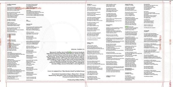
I’ve been working hard on artwork for the 12″ LP. I had already begun using art templates sent to me by my original vinyl manufacturer in Ohio, but since Smashed Plastic has opened right here in Chicago (well, not technically until next month, but they’re running my project early), I’ve been working off their slightly different templates. Maureen and I took the Illustrator file I had for the inner sleeve of the record- with the lyrics and liner notes- and imported it into InDesign then moved things around a bit to conform to the template.
(the front is on the right side, the back is on the left)
There were more creative decisions to be made here than I had anticipated. There were quite a few instances where I had a whole lyric on one line, but it had to be split into two because the columns needed to be smaller than I had planned. Since I like my lyrics to also stand on their own without music, the formatting was not to be done haphazardly.
We fit in a Recaman Sequence graphic underneath the lyrics at about 25% opacity. We started at 30 but I felt the image was competing with the fonts, so we backed off a little.
I don’t remember where I found the main font, called “Red Rose”, but I love how it feels a little techy but still retains a good amount of class.
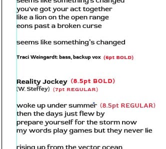
I chose the typography to better organize the information visually. There is a ton of text on the sleeve, and it’s important that the eye can keep it all straight. The guest musician credit at the bottom of the songs’ lyrics is a tiny 6pt but boldface. The song titles are 8.5pt bold, the writer credit is 7pt regular, and the lyrics are back to 8.5pt like the title, but regular (not bold).
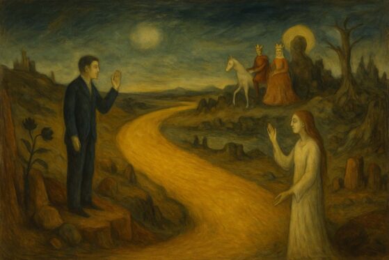
For the album jacket, I chose a font called “Krona One” for my name and the album title, eye-dropping the blues and browns from the butterflies’ wings. When you buy a copy of Reality Jockey on vinyl (and why wouldn’t you?) You’ll see that the record label on Side A is that same blue, and the label on Side B is that same brown.
It’s a ton of fun putting all this together, but I have to admit it’s a bit stressful. After moving around text you need to make sure you didn’t lose a line or a character somewhere, so I played the album in headphones a few times and went through everything line by line to make sure nothing got jacked up in the process. Once these files go out to the printer, there’s obviously no turning back!

