As I’m wrapping up the recording portion of my Reality Jockey album, it’s time to start thinking about album artwork. Usually I have a visual concept long before the music is finished, but this time I’m not sure exactly what to do for the album cover and inserts, etc.
I thought it would be fun to look back at the artwork on my previous 12 album covers and tell you a little bit about the background of each. Maybe it will help to inspire some ideas for my next one!
Up On The Rock (1989)
My first album, Up On The Rock, had three rock guitar instrumentals, a poppy new wave-ish song, a new age soundscape, and a jazz tune with flugelhorn. The album title was a bit of a play on words. In the photograph I’m actually standing on a large rock. The photo was taken at Ravine Beach in Highland Park, IL by Anna Meiser. This image would also end up on hundreds of blue 11×17 posters dispersed all over Iowa City where the 7 song cassette was recorded and available for sale.
Letters Never Sent (1995)

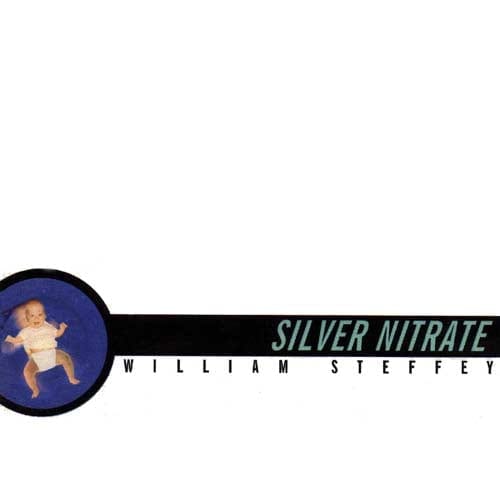
Silver Nitrate (1997)
The songs on Silver Nitrate were recorded onto tape, but manipulated afterwards in audio software on my computer. The album is pretty much a half-and-half as far as analog/digital goes. There was a 3D video that came along with the album for the song Breakdown at Creation which required 3D glasses for viewing. For this reason, the baby picture of myself on the cover has one blue eye and one red eye. Hospitals used to put silver nitrate into the eyes of newborns to prevent neonatal conjunctivitis. The album featured themes of rebirth, and I think looking back, the title was meant to suggest that the album itself was a compendium for those going through personal transformation.
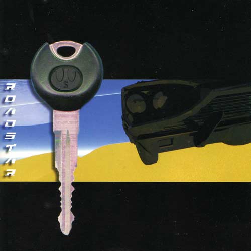
Roadstar (2001)
In 2001, I felt that my music had turned a corner, so I decided to change the name of my label from ‘Blue Room Studios’ to the much punchier and creative ‘Aquariphone Music’. Roadstar was the first release under the new imprint. I felt the music was very cinematic, so I chose to create a graphic that mimicked a 16:9 aspect ratio similar to film. I also wanted an international feel, so I printed the title of the album vertically on the left as if it were a Japanese import of some sort. The car was 3D model that I imported into a program called ‘Bryce 3D’ which I used to create the beach, the sky, the clouds, and the moon. The key was actually a scan of the key to the Mazda MX-6 I owned at the time. I went in and swapped out the Mazda logo on the key for a design using my initials.
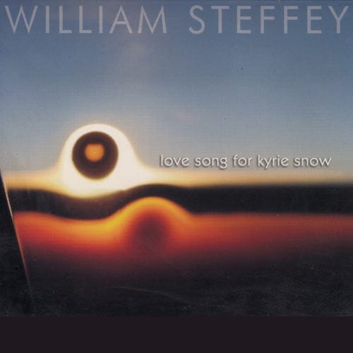
Love Song For Kyrie Snow (2004)
My family went on a trip to Hawaii in 2002. On the jet-ride there, I peered over at my brother Brett’s laptop and he was working on the graphic you see above. He took a photo of the sunset right outside the plane window (you can see the edge of the window on the left) and then manipulated it into a kind of dual sunrise / sunset theme. I loved it immediately and asked if I could use it for an album cover. The songs on Love Song for Kyrie Snow are largely about the sunset of a relationship, or the separation of one unit back into two separate beings. Brett’s art resounded perfectly with these themes. I did a radio campaign for the album and the cover ended up causing some problems. Between the effusive title and the sunrise image, station music directors thought it was some kind of Carpenters album or something and didn’t even bother opening it. The adventurous folks who did open it up and listened to it added it to their playlists and showed it lots of love!
Romance of the Spaceways (2006)
The art for Romance of the Spaceways, as well as all prior covers, were designed not in Photoshop (which I hadn’t learned yet) but rather Corel Photo-Paint. There was a built in fractal generator, so I just went to town on that. The glyphs in the middle give a mystical feel a little bit, but they are simply the symbols for the sun, the moon, and the 9 planets. (I still believe in you, Pluto!) My lyrics are a bit abstract and dreamy (and this album is a tad of a space adventure) so I feel this cover complemented what I was trying to get across with the music.
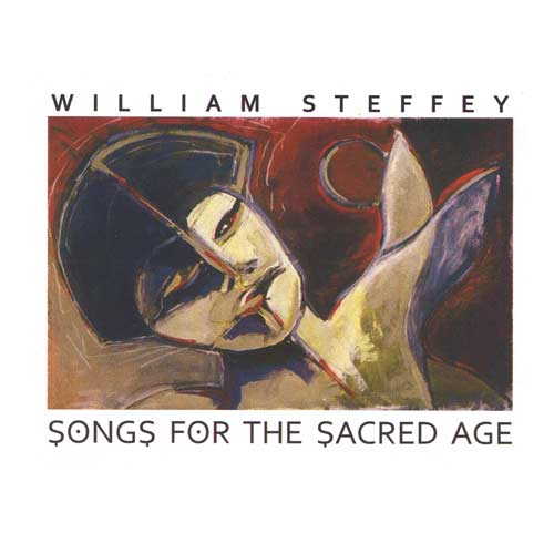
Songs for the Sacred Age (2008)
By 2008, I had hundreds of songs recorded but so few of them released. There were many older favorites that had never found it onto an album, so I decided to do a 2-cd set with 37 songs on it, including the singles from the previous albums as well as these other deep cuts that had never seen the light of day. Again, I see I did a kind of 16:9 cinemascope feel. I remember taking a simple font and adding the dots and lines to create a mood that fit the ‘water-alien’ image. I remember seeing this painting on the wall at Raw Bar on Clark Street back in the early 2000’s. I later found out that it was painted by my friend Dasha Posedel! I asked Dasha permission to use it for this project and she agreed. As luck would have it, I did not have to carefully take an evenly well-lit photo of the nicotine-and-grease-stained original painting that had been hanging up at the restaurant for a decade. Dasha had a professionally shot photographic slide of the newly finished painting stretched out before it was even framed. I took the slide to- Kinkos?- and ended up with a graphic file that I imported into (probably) Photoshop by this time. I made a very short run of these Songs for the Sacred Age cds by hand and numbered them. I’m pretty sure you can still find a few floating around the net.
Love and Armageddon (2009)
Shortly after the attacks on the WTC in 2001 I was completely panicked and irrational. I thought it would be a good idea to buy a couple gas masks. Not sure what I was thinking. While they never came in handy for a Sarin attack, thankfully, I did use one for the cover of my Love and Armageddon cd. In the leadoff track, ‘This Show Must Go On’, there is a lyric ‘making love on the beach beside the bodies and the bombs’. I felt that this image of a gas mask with lipstick traces, well, now it seems a little too on-the-nose, but at the time I thought it was genius of course. Victoria Sprung expertly photographed the gas-mask which we hung from a wall by a nail, and Alessandra Santucci helped me make the lipstick look realistic.
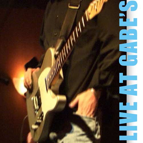
Live at Gabes (2009)
I put a band together to play some of the songs from the Love and Armageddon cd, and one night we played up in Highwood, IL at a bar called Gabe’s. My friend Micky Barendt did an excellent job of multitrack recording the show then mixing it afterward. The songs we didn’t fuck up too badly ended up on this internet-only release, Live at Gabe’s. I grabbed the image from the video that was shot that night. I have no idea who was running which camera, so I’m giving credit to either my brother Brett Steffey, or Josh Gort who was also kind enough to help us film the show. Simple 180° block-letter text on the side almost gives the feel of a paper flyer.
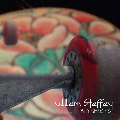
Kid Ghosts (2012)
In 2012, my gf at the time had spent some time in D.C. and had a back-piece tattoo of Cherry Blossoms. I snapped a photo of that and blended it with a skateboard image that Marfa Capodanno took for me. Kid Ghosts was Kickstarter funded (thanks to everybody who donated!). The skateboard was to represent the Kid Ghosts themselves. As far as the tattoo? I think it just looked really cool and the colors were complementary. Dig the font, too. Can’t remember what it’s called.
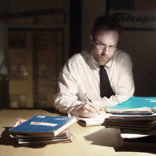
Accidents and Melodies (2015)
All the songs from Accidents and Melodies were recorded during the month of the RPM Challenge in February of 2015. It was an internet-only release, although it did chart on CHIRP Radio’s top ten. I didn’t spend any money promoting it, which I sometimes regret. Since the album was heavily ‘songwriting’ focused (coming off the 10 songs in a month challenge) I decided to show myself writing amidst stacks of my notebooks. I took the picture myself in my kitchen using a timed camera. In the first photo (where I am fully lit) the window on the left was totally darkened out. I turned the lights off in the kitchen and reshot the scene (without me in the picture) then went in and replaced the blacked-out window with the window from the second photo, where you can see the apartment across the street. This album cover also pays gentle homage to Donald Fagan’s Nightfly album cover.
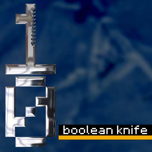
Astrid and the Killer Penguin (2016)
The last 3 songs recorded during the RPM Challenge I ended up releasing under the band name ‘Boolean Knife’. The EP was called “Astrid and the Killer Penguin“. The name Boolean Knife was originally the title of one of the songs. Since I liked the name so much for the band, I switched the title of the song to ‘The Visitor’. The background of the album cover is washed out ice (as the literal action of the lyrics is set in Antarctica). The vertical chrome knife logo is comprised of a numeral ‘zero’ (making up the knife handle) and a numeral ‘one’ (making the blade). In logic, and consequently computer programming, a boolean is a variable that can only be true or false. I think so much of the way we see the world is just that way: opposites. It’s good or evil, hot or cold, black or white. Reality is more complex than that, and the binary way we’re used to thinking strips out a lot of the nuance from our sense of things. The knife cuts things into two. Robs us of a whole experience.
Reality Jockey (2018)
As mentioned at the top of the article, I still am not sure what direction to take for the cover of Reality Jockey. Since we’re talking about reality here, and I was just talking about binary perception, I think this new album should include the theme of ‘rising above the field of opposites’. The evolutionary stage beyond binary thinking. I have a few typefaces picked out that I’m playing with, and am hoping to create a glyph that expresses ‘reconciling opposites’ as elegantly as the Boolean Knife logo did for ‘binary thinking’. I’d like to make die-cut stickers of this glyph to send out on the mailers to radio and press. I’ll keep you posted on my progress.
What is your favorite album cover of all time and why? Let me know in the comments!


